
July 13, 2021
Category
Digital Marketing
4 min
.png)

When it comes to keeping in touch with audiences, building better customer relationships, and boosting your sales, it doesn’t get any better than email marketing. Don’t just take our word for it though; according to a recent study, 80% of business professionals believe that email marketing increases customer retention, while 59% of marketers say email is their biggest source of ROI.
Gone are the days of text-only email newsletters devoid of color, however. These days, if brands want to provoke action, they need to know how to design an email successfully, so it strikes the right chord.
Thankfully, we’ve rounded-up our best email design tips to ensure you get it right every single time you hit ‘send’. Let’s get started!
Visual hierarchy is vital in an email, as it involves placing emphasis on particular elements to make them stand out among the other content, signaling that they are important. It's based on the order of visual significance, rather than aesthetics or design styles.
Visual hierarchy allows the presentation of information in a structured manner through embracing design elements such as:
Similar to the ‘inverted pyramid’ method used in journalism (such as newspaper reports), this principle places the most important information at the beginning and rest of the information is arranged in the order of lessening importance.
Keep in mind that, on average, a reader will only view a marketing email for 15 seconds. As a result, you’ll want to place the most action-provoking content at the top of your email, where they’re guaranteed to see it. The trick is to make an impact, and to do so quickly.
One example would be to place an action-provoking headline, along with your CTA (call-to-action) above the fold. This would then be followed by detailed information about the product or service you’re marketing, and end with social sharing buttons placed in the footer of the email.

Interactive elements in an email don’t just look good, but studies have also shown that they can improve unique click rates by as much as 18% and click-to-open rates by 10%. A whopping 81% of email marketers believe interactive content captures your subscriber’s attention more than traditional email design, and trust us, they’re not wrong.
This is because encouraging interactivity is one of the most effective ways to get readers engaging with your email on a new and exciting level. It also sets your email apart from the hundreds of other marketing emails they receive on a regular basis and encourages them to look forward to your newsletters hitting their inbox. Hello loyal fans!
So, what might an interactive design element in an email look like? Think:

You see, email service providers like Outlook and Gmail are still catching up with the technological capabilities of CSS, so you will need to consider this if choosing to implement interactive design elements in your next campaign.
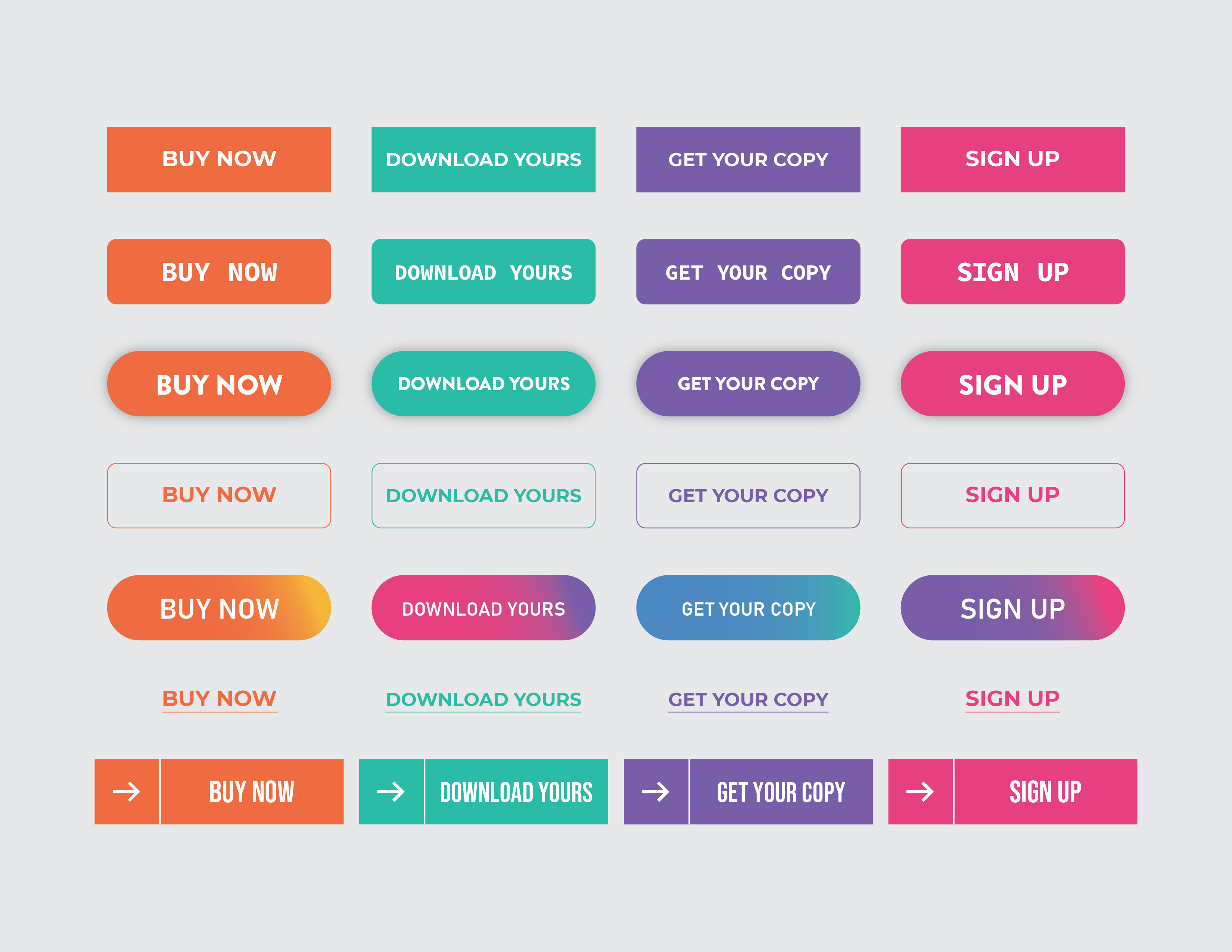
We mentioned calls-to-action (or CTAs) earlier, but they really are an important element for provoking your reader to take your desired action, whether that’s buying your product, signing up to a service, downloading a white paper, or more.
When writing your CTA, you’ll want to use active language in a short and clear manner, such as “Buy Now” or “Get Your Free Copy”. In other words, tell the reader exactly what you want them to do.
Along with what you write for your CTA, the placement and design of your CTA is equally as important. This is because you want to draw the reader’s eye to the CTA button and make it too irresistible for them to continue scrolling.
We recommend placing it above the fold (so it’s visible before the first scroll), or even better, utilizing a fixed CTA so it is always on-show – no matter what part of the email the reader is viewing.
Furthermore, you don’t want your viewer to have to squint just to see it. Make your CTA button big and bold so it’s unmissable. Oh, and bonus points if you can add additional visual elements such as a shadow or 3D effect to really make that button ‘pop’ off the screen.
Speaking of bold, the color of your CTA also has great importance. What color in your brand color palette is most attention-grabbing? Now, think about how you can utilize that color within your email to ensure the CTA button stands out, rather than blends in with the rest of the email’s color scheme.
If you have to use a color not already within your typical branding, don’t sweat. Just ensure it provides a contrast with the rest of your content without looking garishly out of place. Two commonly used examples include a black or bright red button, with white text.
Color psychology plays a vital role within any design, and your marketing emails are no exception. Within your newsletters or email campaigns, you can still use specific colors to trigger feelings or emotions within the reader, therefore further encouraging them to perform a particular action.
Let’s take a look at some of the common color associations below.

Of course, it’s worth mentioning that you should only stick to a color palette of no more than 3-4 different colors, as you don’t want to overwhelm the viewer.
When choosing colors for your email, you should take multiple things into account, including your:
Here’s the thing: when your content is all over the page and misaligned, it can be hard to read, let alone inspire a viewer to take action. This is why alignment also plays a vital role in the effectiveness of your email.
If your content is minimal, such as a few sentences with a CTA button and accompanying imagery, then centering it will work best, as it keeps the overall design balanced.
However, if your email is a little heavy on textual elements, then we recommend using a left alignment to ensure everything remains legible, as this will mimic our natural reading patterns.
Whichever alignment you opt for, it’s important to keep it cohesive throughout the entire email, or you risk turning readers away entirely. After all, you want the email to look harmonious, therefore putting the reader in a better headspace to inspire action.

It’s no surprise that humans are drawn to images. The human brain processes images 60,000 times faster than text, and 90% of information transmitted to the brain is visual.
A perfectly designed marketing email contains a balance of both text and imagery. This is because it is the imagery that will capture a reader’s attention upon opening the email, but the text that will provide them with further information and aid in convincing them to stick around and take the desired action.
So, how can you further use images to your advantage when designing an action-provoking email?
Use an eye-catching and on-brand image above the fold to pull the reader in and utilise images throughout the email to further enhance the text.
Here are just some ideas for visuals you can incorporate within your email to further convince the reader to take action:

You might not have considered it before but using whitespace to make your email feel more spacious can also work in your favor.
This is because whitespace can bring the reader’s attention to the most important, action provoking parts of your email, like that all-important CTA. Additionally, it gives your text and imagery the breathing space they need to truly shine and prevents the viewer from becoming visually overwhelmed.
You must also keep in mind that us humans are a busy bunch, with many of us constantly short on time. Whitespace assists with the organization of information and aids with skimming over the content to find what’s most vital – something we all do more than we realize.
As you can see, emails are a must-have method in your marketing toolkit, but the trick to provoking action with your audience all lies within the design. By utilizing the tried-and-tested tips above, you’re sure to not only keep in touch with audiences, but build better customer relationships and boost your sales too.
Got a question about email design or want to outsource this task to the professionals? Get in touch today, because our experienced graphic designers would love to help!
Ian is the owner of Graphic Rhythm as well as other businesses that revolve around design, copywriting and Amazon marketplace selling. He's an expert in communicating persuasively and loves helping business owners and digital agencies breathe life into their projects and ideas.
He values generosity and attention to detail and strives to make sure these values are apparent in the services he provides and the businesses he owns.
When Ian isn't working, you can find him outside hiking, camping and spending time with his wife and children
Ian is the owner of Graphic Rhythm as well as other businesses that revolve around design, copywriting and Amazon marketplace selling. He's an expert in communicating persuasively and loves helping business owners and digital agencies breathe life into their projects and ideas.


Sep 21, 2023
Read more
Aug 17, 2023
Read more
Jul 28, 2023
Read more
Jul 4, 2023
Read more.jpg)
Jun 9, 2023
Read more
Jun 2, 2023
Read more


Dec 14, 2021
Read more


Oct 4, 2021
Read more
Sep 28, 2021
Read more


Aug 16, 2021
Read more


Apr 23, 2021
Read more


Dec 21, 2020
Read more

.png)
Nov 18, 2020
Read more

Oct 27, 2020
Read more


Oct 27, 2020
Read more
Oct 27, 2020
Read more


Oct 27, 2020
Read more

Ready to get started?
Get in touch or create an account


