
Category
Design
12 min
.png)

Blogging is a serious business including your blog design. We talk a lot about “influencers” on social media. But it’s amazing to discover that bloggers are actually the most trusted of all media, beaten only by friends and family.
With so much potential to influence people with your content, there’s no excuse in letting your blog design slip in the race to get quality content out there.
In this post we’ll look at 10 amazing blog designs that ensure that their content gets the attention it deserves and features awesome design touches that make them stand out from the competition.
Photographer Eric Kim’s blog design is all about high contrast black and white juxtaposition. It forms the backdrop for his landing page. Here we see the dates for his latest photography workshop tour in simple white text, contrasted against a monochrome cityscape backdrop (the background photo changes each time you visit the front page, but the images are always non- obstructive to its readability).

Source: Eric Kim

Source: Eric Kim
Key info like an early bird discount and new dates are picked out with dramatic red orange all-caps font to draw the eye to key information.

Source: Eric Kim
A massive part of what makes a blog design standout is consistency. This is especially true with small details like font type and color.
The banner section of his blog is marked out by a tasteful thin white line. Notice how things aren’t just bunched up at the top? There’s plenty of space to let the layout “breathe”.

Source: Eric Kim
And notice the consistency of font above and beyond the banner section. The fonts are uppercase, to distinguish them from the page body text, and all the fonts match Kim’s classy logo font.

Source: Eric Kim
If we scroll down below the fold we’re hit by the first blog post thumbnails.

Source: Eric Kim
The first thing to note here is the color scheme has flipped, we now have black font on a white background, rather than vice versa. This adds extra visual interest and also makes the fonts easier to read at length.
The thumbnails are nice, sharp edged rectangles with no beveling to emphasise the stark contrasts of Kim’s style. But notice that the thumbnails do stand out against the background for two reasons.
One, they are white boxes contrasted against the light grey color of the background. And two, there is enough color difference in the images he uses to make the photos stand out against the black image of the above-the-fold space of Kim’s blog.
A really nice touch here is that the thumbnails become the new page background when you click through to individual blog posts.

Source: Eric Kim
The images are slightly greyed out to make the title and banner font easier to read.

Again the text is located in a crisp white box contrasted against the photo header and the grey sidebars. This use of blocks of color cutting into each other has a very painterly/arty style that resonates with Kim’s photography, which is the feature of his blog.
We particularly like the really nice, subtle visual touches going on here, like the vertical red line that links the title to the body of the blog post.
Unlike with the darker, artier stylings of Eric Kim, inbound marketer Tyrona (Ty) Heath has a more energetic blog design that really makes it stand out.
She has more of a demarcated space for her header, which exists in a white space above the sliding photo banner.

Source: Spectacled Marketer
She’s gone with a graphic logo which is simple but adds a nice bit of visual interest to the page header.

Ty uses a refreshing light sea green color (#30bcc1 to be precise) for her menu links, a color she also uses to pick out the word ‘marketer’ in her logo.
There are some of the nice small touches we like here too, like the thick line under ‘home’ and the little rocket ship icon in the ‘talk to ty’ link. The rocket symbolises getting things done quickly and powerfully, and it’s a nice touch.

Often the blog section of sites is tucked away in a corner and has a fairly mundane layout. But Ty’s blog section looks like anything but an afterthought.
The white header bar remains from her homepage to give us consistency as we navigate through her site, but her blog design shakes things up a bit.
We have an inspiring skyline shot with planety of blue sky to suggest big ideas. Cleverly, the sky has a tint that goes well with her main seagreen color.

The addition of an icon for the blog section is a very nice touch and shows how easily a blog design can be made visually appealing and attractive.

Source: Spectacled Marketer
Ty makes great use of blog post thumbnails here.

Each has a colorful image with similar color tones, and enough uncrowded space for text to be superimposed upon them.
Here we see the introduction of handwritten font which is a nice way to symbolise the personal touch that blogs bring to any website. They also help distinguish title font from subtitle font.

Source: Spectacled Marketer
When we click through to the blog post we see things are very clearly laid out, and the introduction of all-caps font for titles, with contrasting black and white text boxes, steps the blog up a gear and shows we have switched into ‘serious’ mode and are going to be getting some powerful content.
The structure of the blog post themselves is an important part of blog design and we can see that it resonates with the overall design principles of her blog. We have bold text and subtitles in Ty’s signature seagreen which means her personal branding is all over her blog content.
She’s using memes to break up the copy and introduce a dash of humor which resonates with her usp:

That’s the thing about great blog design; it’s all about tying these small details together to create a coherent brand look.
The meme we saw above was made for free in Imgflip. But Ty also uses graphical designs in her blog posts.

Source: Spectacled Marketer
The designs are clear, impactful and based around a monochrome style with color hints used to highlight key info. She also takes the opportunity to add her logo to ensure that if this image is shared her brand will gain additional exposure.
The Story Fuel blog is super stylish.

Melanie Deziel sets out her stall as an expert on branding with a sleek, minimalist use of design and illustration elements that fits together really smoothly and looks super modern.

Her page header is beautiful rendered with nice crisp black and red font and a sleek greyscale line illustration to give it that next-level touch.
A lot of thought has gone into the color scheme which is different from many blogs because it uses a light grey font; this gives a sophisticated look to the blog and means that bold, black fonts stand out well in contrast, as does the judicious use of red uppercase text that really makes things pop.

Source: Story Fuel
We particularly like the ‘contact me’ section at the bottom of each blog post:

Like the rest of the blog it’s simple, stylish and impactful. The link for a free story idea guide is also a great way to drive engagement, and the social media icons (again, in keeping with her aesthetic) are an especially nice touch.
We love the impactful simplicity of Nia Shanks’ fitness blog.
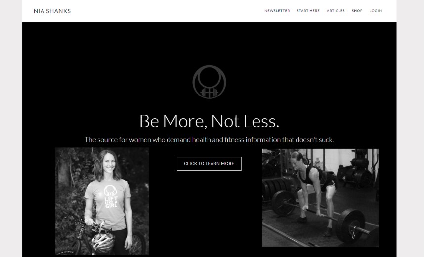
Source: Nia Shanks
The monochrome color palette makes her blog stand out from other fitness blogs (particularly for women) which tend to be more ‘vibrant’ and full of color. This powerful, no nonsense attitude resonates with Shank’s USP, to provide women with “fitness information that doesn’t suck."

The blog section is simply laid out with a decent amount of white space, and the use of non-bevelled thumbnails without any borders sends the signal that ‘this content stands on its own merit.'

Shanks aims to talk to women in a non-patronising, non-stereotypical way, and her blog design reflects this. Notice the subtle use of pink for links:

This sparing use of pink is a nice contrast from the black/grey and white design of the blog and suggests to her readers that it’s possible to be both traditionally feminine and reject the stereotypical way women are told to exercise and diet.

Nia Shanks has a really eye-grabbing lead form at the bottom of her posts, which cranks up the pink (but it’s a shocking pink, not some rose petal affair):

We particularly like the ‘you’re here for a reason’ link in the footer. If you haven’t clicked a link already you’re bound to click on this. Shanks is really making every element of her blog design work for her.
Heather B. Armstrong’s Dooce blog is one of the most popular on the web, and that’s no small feat.
Armstrong has a very personal, frank, and crudely funny sense of humor and that comes across in her blog design.
Her logo is a black line drawing which has a cartoony feel, but it’s also slightly dark and moody, which fits with her tagline of being “our lady of perpetual depression”. This strain of dark humor runs throughout her blog design.
There's a lot going on in her front page but it’s all designed to draw the eye anti-clockwise from upper left to bottom right, then to upper right:
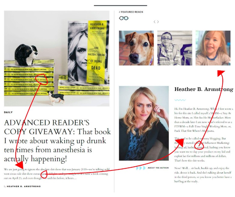
Dooce’s blog design ends with a nice lead magnet and links to her products and exclusive members community.
We paericulaelty like the tasteful use of line illustrations with subtle splashes of color to give everything that uber-professional finishing touch that makes any blog design stand out from the crowd.

Gary Vee is the master of high powered, 10X style marketing. His energetic, assertive consulting style is reflected in his blog design.

He gets straight to the point; look at the action movie style reds and yellows on his blog page, part of an image that features one of many shots of Gary looking natural and mid-flow.
There’s a filter over the image too that gives out the kind of rock ‘n’ roll/DIY aesthetic that Vaynerchuk likes to cultivate.
If we scroll down below the fold we’re hit with lots going on, but it’s not too overpowering. The supposed chaos is actually controlled by a layout that, like with Dooce’s manic style, draws the eye counterclockwise through a range of click magnet content.

Vee makes good use of the sidebar which really grabs the eye and motivates readers to dive deep into his content.

Notice too how illustrations play a key role in making his blog design pop.

The graphic elements range from detailed illustrations like above, to simple but pro-looking photos with text overlays.

Whilst Gary Vee has a very high octane, energetic style that fits his brand perfectly, Lorena Salinas’ Cravings Journal has a refreshing, inviting feel, with its minimalist design using plenty of calming white space.

Source: Cravings Journal
The header consists of tasteful serif font with subtle grey lines giving the layout form, without demanding too much attention.

Lorena has a foodie YouTube channel too, and it fits with her stylish blog design:


It’s worth noting that the minimalism of this blog design does serve a crucial purpose: it acts as a kind of palette cleanser for the sumptuous food photos that dominate the layout. An awesome blog design doesn’t have to be all bells and whistles, it can be a transparent window through which your content can shine.
We particularly like her Instagram sidebar, which highlights the kind of photos she posts and makes it really easy and tempting to click across and follow her on what is possibly the most food oriented of all platforms.
Ryan Robinson means business. And his blog reflects that.

Source: Ryan Robinson
He uses the header of his blog to lead with his value proposition: teaching people to gain independence by starting a side business from scratch and scaling up.

All roads lead to subscribing to his side hustle community, and there's’ plenty of engaging content in a well laid out format, with a big focus on eye-catching visual elements like post thumbnails.

There are some nice design features here, like a share counter.

Source: Ryan Robinson
He adds interest by using infographics with a few simple yet effective visual elements to create extra interest.
And his bio and headshot remain on the top right of his blog’s sidebar when you read his articles, so you're always reminded of his brand presence and prompted to follow him on social media.

We haven’t spoken about pop ups yet, so it’s a good idea to talk about Ryan’s.

They pop up on the screen with a little animated jiggle which is a nice touch, and they are clear, use bright primary colors, and easily direct the eye to sign up to his email list (which is a big part of his content strategy).
We particularly like that he also makes some really nice infographics with which he adds even more visual interest to his blog design.

Brian Dean’s Backlinko blog is all about taking things to the next level. And his blog design delivers on that hugely.

Source: Backlinko
Notice how much space there is above the fold.

The lead form is designed to direct the eye from top to bottom, and then nudge the viewer back up to the email field. This use of blog design to direct the eye towards clearly highlighted actions is very powerful and is a big part of why Backlinko is such a formidable player in the SEO community.
Once we get beneath the fold we’re hit with lots of design detail that gives his content a powerful visual dynamic.

Notice that once again he’s using the sidebar to funnel people to his email list.
We particularly like how he designs his lead magnets on this blog.

He uses color blocks to break up the text and small design touches that make everything look super professional. The use of avatars for Brian and his quote source adds a human touch, and makes clever use of attractiveness bias to endear his blog to his readers.
All the blogs we’ve looked at so far use graphic elements in their blog designs to create a slick, professional feel. Neville Medhora’s Kopywriting Kourse subvert this idea, using deliberately childish illustrations to add humor and visual interest to his blog. It’s a refreshing design touch which makes him stand out in an oversaturated market of copywriting gurus.

Source: KopywritingKourse
The great thing about the Kopywriting Kourse blog design is that although he has a super informal, jokey style, he means business, and this is reflected in the content upgrades and click magnets that are effortlessly worked into his blog.

Neville even uses a touch of animation in the designs he uses for his blog, a touch that goes the extra mile to create visual appeal and deliver an engaging reading/viewing experience for his audience.

And if that’s not going to create a loyal following for a blog, nothing is.

We hope that you’ve seen that there is no one-size-fits-all way to create amazing designs for your blog. Each blog we've looked at fits perfectly with the brand identity of its host. The design elements are used as an extension of these bloggers’ brands.
Read through this list before starting work on your blog design, or link your blog developer to this post to give them an idea of the way you want your blog to be designed.
It’s not about copying other people, but being inspired by some of the best blog designs out there today.
Happy designing!
Danni is a freelance writer based in glorious Glasgow, Scotland. She writes about web design, SEO, digital marketing, and advice for freelancers and small businesses. When not writing she plays fingerstyle guitar and learns to code.

Jul 4, 2023
Read More

Sep 21, 2023
Read more
Aug 17, 2023
Read more
Jul 28, 2023
Read moreJul 4, 2023
Read more.jpg)
Jun 9, 2023
Read more
Jun 2, 2023
Read more


Dec 14, 2021
Read more


Oct 4, 2021
Read more
Sep 28, 2021
Read more


Aug 16, 2021
Read more


Apr 23, 2021
Read more


Dec 21, 2020
Read more

.png)
Nov 18, 2020
Read more

Oct 27, 2020
Read more


Oct 27, 2020
Read more
Oct 27, 2020
Read more


Oct 27, 2020
Read more

Ready to get started?
Get in touch or create an account


